Lol, so true. Looks like I've done everything you reccomended but the final dull coat. I think I have a spray that might do the trick. I'll upload new photos when it's finished. Thanks again!Originally Posted by Oberst Hajj


Lol, so true. Looks like I've done everything you reccomended but the final dull coat. I think I have a spray that might do the trick. I'll upload new photos when it's finished. Thanks again!


Just a couple of points to look out for. The transition on the leading edge of the wings. It is always something that is noticeable. Then a few spots where you have a bit missing from the red stripes. This can be dodged in by hand to cover the gap. Do not try to get an even edge. Just fill in the worst.Peoples eyes will do the rest at that scale. The most noticeable bit is on the tail. With painting these planes,it is not the mistakes, believe me we still all make them, it is knowing how to fudge the mistake so that it blends in that is the real skill.
Remember, practice does not make perfect, but it can help to deceive the eye.
Rob.
"Courage is the art of being the only one who knows you're scared to death."
Thanks for the advice Rob!I'll begin the improvements today.

Im very impressed you managed that by hand! I cheat and air brush in the stripes so getting what you did by hand and brush is excellent.
As Oberst Hajj said, zero gloss! These arecraft wings were pretty much translucent as well so they absorbed light. rather than giving the plane a gloss finish to blend in decal but a decal fixing agent such as Vallejo, it will hide the lines and also slightly thin the decal and allow it to form around the contours of the model better.
opps, one more thing..... as for filling in the gaps I would actually mask again and use layers of slightly thinner paint so it blends. For the Wing leading edge mask the length of the wing and run a line of white paint to tidy up the edge.
As Rob mentioned red and white combination are a very unforgiving colour to work with as they both highlight every little thing.
Apart from that top notch effort sir! +1
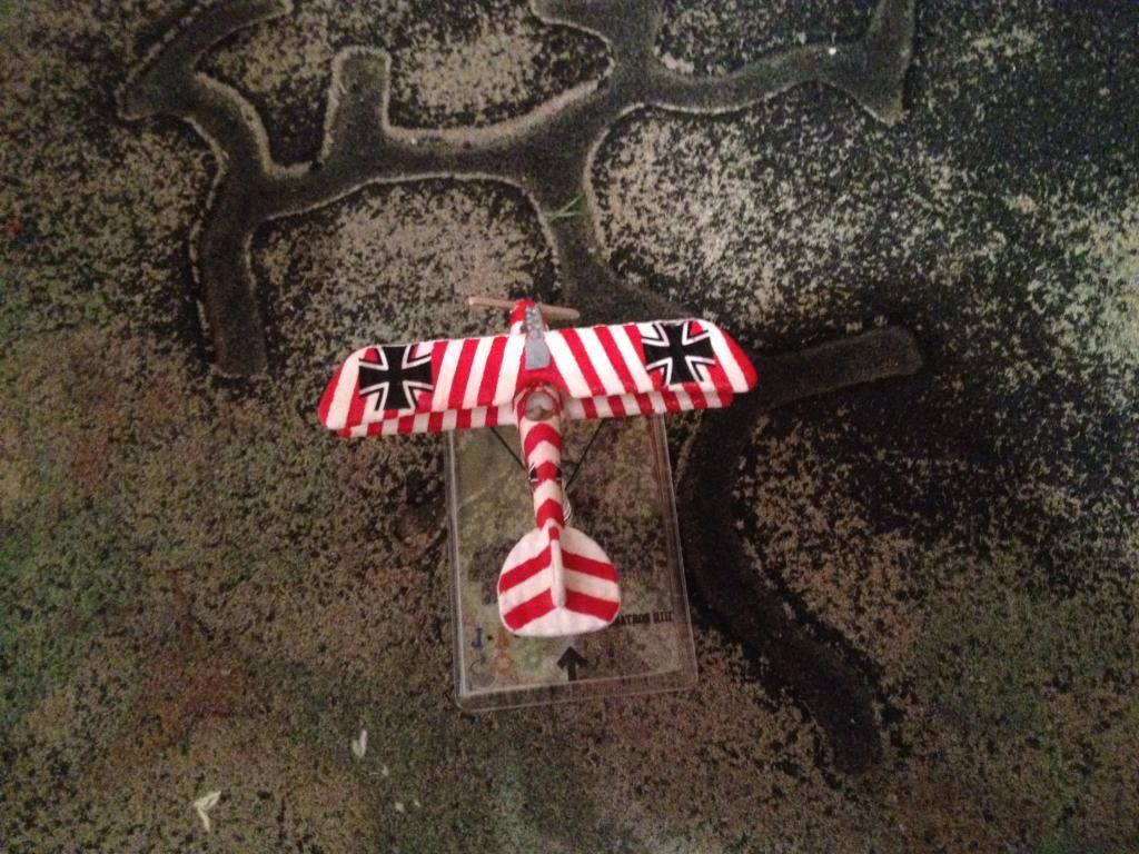
Well gentlemen, I took some advice from all of you and touched up my model this afternoon. Here is the final product:
Albatross D.III flown by Obltn. Josef Loeser, CO of Jasta 39 from 4 December 1917 - 4 February 1918. Two aerial victories.
Now that sir is beautiful
Thank you!
Wow, what a looker!
You're a brave man attempting diagonal stripes like that.
Hey thanks Kev! I've liked Josef Loeser's paint scheme ever since I first laid eyes on it while flying in Rise of Flight. My brothers and I have taken to calling it "the candy-cane plane"; appropriate I guess with Christmas just around the corner lol.
That is a cracking job Cole.
You could enter an aircraft of that ilk in the next painting comp.
Rob.
"Courage is the art of being the only one who knows you're scared to death."
If you haven't seen it on other threads, this card may be of interest to you, Cole:
Albatros D.III Jasta 39 - ObLt Joseph Loeser
Last edited by flash; 11-18-2014 at 08:35. Reason: Deleted spurious pic
Mike
"Flying is learning to throw yourself at the ground and miss" Douglas Adams
"Wings of Glory won't skin your elbows and knees while practicing." OldGuy59

Looking much better!
Thanks so much for the advice and kind words guys! Both are sincerely appreciated.
@Oldguy59:I can't believe you found a card for Josef Loeser! That is exactly what I need - thank you!!

Albatros DIII: Ernest Udet; Jasta 15 Jan 1917, shortly before taking off and engaging on its one-on-one famous duel with Guynemer
Repaint: good grain effect with burnt-sienna and raw-umber (1-1) oil-based colors applied over white base
Decals: home-printed
Pilot: reviresco


Last edited by flash; 01-10-2018 at 00:09. Reason: spelling
Just love seeing the custom paints. Very nice work and thanks for sharing. Happy New Year!
Fantastic work, as always. Love the Loeser & Udet!

Lt. Karl Schafer's Albatros D.III.
Lt. Kurt Wolff's Albatros D.III
Lt. Karl Allmenroder's Albatros D.III
Very smart looking aircraft as i mentioned in your other thread Mark.
Rob.
"Courage is the art of being the only one who knows you're scared to death."


Very nice Mark, like all three but I like Schaefers most.
Nice set of planes Mark.
Wow Mark! Those look absolutely gorgeous! I say, well done old boy!
)
A repaint od Albatross DIII:
Albatross DIII – Joachim von Bertrab Jasta 30
Stay tuned
Carlo
Hello Carlo, that looks good... but I think you have the personal insignia on backwards. I'm pretty sure that the "comet" should have the star in front on both sides.
Yes I'm afraid you are right Keith.
Rob.
"Courage is the art of being the only one who knows you're scared to death."
Oohps...
Immediatly I'll correct the direction of the comet!
Thanks a lot
Carlo
Albatros D.III of Lt. Günther Schuster, Jasta 17, June 1917
(Shapeways FUD by decapod)
Albatros D.III of Offz.Stv. Friedrich Altemeier, Jasta 24, Summer 1917
(Shapeways FUD by decapod)

Very nice Alex. All these great Albatros DIIIs are inspiring. I can't wait to find the time to do some myself.
Another masterful bit of work Alex.
With all the aircraft you have posted recently i feel a bit of cred id due.
Rob.
"Courage is the art of being the only one who knows you're scared to death."


DITTO!!!!
I'm pretty sure my workrate will drop over the next months.
Right now, I'm riding the wave of beginners enthusiasm.
Cheers
Alex


Very nicely done Alex
I like the way the colours on the top and bottom wing swap over. Nice work Alex, it looks fantastic.
Ian
Here is a Shapeways DIII, Constantin Krefft of Jasta 11


Another Shapeways DIII, George Simon, Jasta 11

And another Shapeways DIII, Karl Emil Schafer, Jasta 11.

Nice looking kites, Peter. Like the Schafer, especially.
Super paint work, Peter!
I especially like the wood effect - something I have yet to attempt.
Heads up - REP incoming!
Some great looking aircraft, Peter, and an excellent rendition of the plywood fuselage.
How did you do it?
Sweet looking birds, Peter!
The woodwork is just stunnning.
Looking great Peter
Thanks. The woodwork isn't that difficult to do. I first paint the fuselage with a tan/yellow. The tough part is the fine lines for the plywood seams.
Last is a brown wash. I do that with a small stiff fan brush. I run the brush over the wood as the wash is drying. If the surface is smooth you can get some subtle grain lines.
Last edited by Teaticket; 09-14-2015 at 06:14.


There's a technique I never thought of. Thanks for the tip!
Thanks for the info.
I was thinking about a brown wash, too, but I was afraid the dark pigments would settle in the sometimes grainy surface of the Shapeways models,
producing a kind of dirt effect instead of a grain effect. Maybe I'll give it a try next time.
Do you do the seams with a brown pencil or with a fine brush?
I use a very fine brush. If the seam is too wide you can go back with the tan/yellow and thin it down to where you like it.
The surface, if bumpy probably won't give you the wood grain lines even with lightly dragging the fan brush. As you said, the pigments will settle in the depressions.
I wouldn't try it on a grainy model. Grainyness (if that is even a word?) can be minimized with multiple primer coatings.
Forgot to mention I use Vallejo and craft acrylic paints. Using oils would get better results as you can work it better before it dries.
Here's a couple of fictitious Albatri for the Eagles
one pilot undecided yet
and for ObLtn Sonneck
both Shapeways,
paints Humbrol acrylic,
decals by Dom.
Very nice work there, Mr Biggles!
I laugh in the face of danger - then I hide until it goes away!
 Posting Permissions

 Reply With Quote


Bookmarks